Website Auditing
Website Auditing
Website Auditing

Internet Archive
Internet Archive
Internet Archive
Role
Role
Researcher
Researcher
Time
Time
10 Months
10 Months
Tool
Tool
Figma
Figma
Contents of Audit
Contents of Audit
Scope
Scope
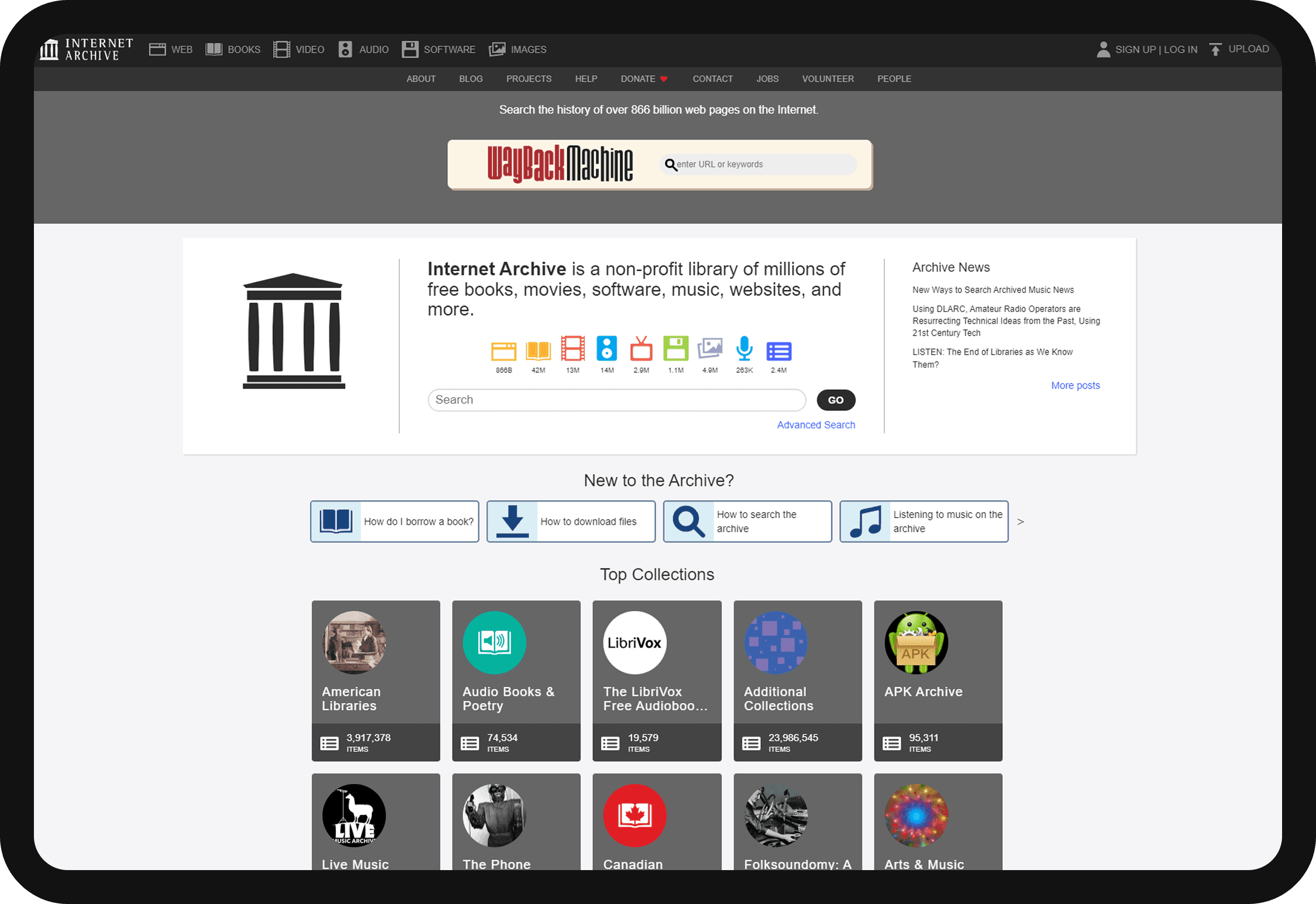
The scope of this audit includes a comprehensive evaluation of the Internet Archive website's user experience (UX) across various aspects. This evaluation encompasses usability, information architecture, accessibility, and overall user satisfaction. The audit will focus on identifying strengths and weaknesses of the website.
The scope of this audit includes a comprehensive evaluation of the Internet Archive website's user experience (UX) across various aspects. This evaluation encompasses usability, information architecture, accessibility, and overall user satisfaction. The audit will focus on identifying strengths and weaknesses of the website.
Goals
Goals
The goal of this audit is to thoroughly evaluate the website to determine how effectively it serves its users. This involves assessing the website's usability, ensuring it is easy for users to navigate and complete tasks; evaluating accessibility to confirm that the site is usable by individuals with disabilities; analyzing the information architecture to ensure content is well-organized and easy to find; reviewing the consistency; and measuring user satisfaction to identify areas of contentment and frustration.
The goal of this audit is to thoroughly evaluate the website to determine how effectively it serves its users. This involves assessing the website's usability, ensuring it is easy for users to navigate and complete tasks; evaluating accessibility to confirm that the site is usable by individuals with disabilities; analyzing the information architecture to ensure content is well-organized and easy to find; reviewing the consistency; and measuring user satisfaction to identify areas of contentment and frustration.
Summary
Summary
The analysis reveals several critical issues that impact the effectiveness and efficiency with which users can access and interact with the website's vast digital collections. Navigation difficulties, suboptimal search functionality, and inconsistent visual design elements are among the primary concerns identified. Accessibility issues, such as insufficient alt text and inadequate keyboard navigation, further detract from the user experience. While the website's mission and resources are highly valued, these UX challenges need to be addressed to enhance overall user satisfaction and engagement. This audit offers a clear and detailed understanding of the current user experience, serving as a foundation for future improvements.
The analysis reveals several critical issues that impact the effectiveness and efficiency with which users can access and interact with the website's vast digital collections. Navigation difficulties, suboptimal search functionality, and inconsistent visual design elements are among the primary concerns identified. Accessibility issues, such as insufficient alt text and inadequate keyboard navigation, further detract from the user experience. While the website's mission and resources are highly valued, these UX challenges need to be addressed to enhance overall user satisfaction and engagement. This audit offers a clear and detailed understanding of the current user experience, serving as a foundation for future improvements.
Analysis Research finding includes:
Analysis
Research finding includes:
Analysis Research finding includes:
Acknowledgment and recognition of Author's work to support the thought process.
Acknowledgment and recognition of Author's work to support the thought process.
Design and Typography
Design and Typography
Design and Typography
Form and Text Field
1
2
3
4
5

The website violates NNGroup’s standard, which recommends marking required fields with asterisks (*) for clear visual identification.
Form and Text Field
1
2
3
4
5
The website violates NNGroup’s standard, which recommends marking required fields with asterisks (*) for clear visual identification.
Form and Text Field
1
2
3
4
5
The website violates NNGroup’s standard, which recommends marking required fields with asterisks (*) for clear visual identification.
Form and Text Field
1
2
3
4
5
The website violates NNGroup’s standard, which recommends marking required fields with asterisks (*) for clear visual identification.
Tabs
1
2
3
4
ALL CAPS reduces readability and deviates from standard UI practices.
Tabs
1
2
3
4
ALL CAPS reduces readability and deviates from standard UI practices.
TYpe
1
2
3
The homepage violates NNGroup’s guidelines by using over six text sizes and four fonts ('Helvetica Neue', Helvetica, Arial, sans-serif), exceeding the recommended maximums and affecting readability.
TYpe
1
2
3
The homepage violates NNGroup’s guidelines by using over six text sizes and four fonts ('Helvetica Neue', Helvetica, Arial, sans-serif), exceeding the recommended maximums and affecting readability.
Iconography, Images, and Illustration
1
2
3
4
The site violates NNGroup’s guideline requiring text labels for icons; missing labels and unexplained item counts cause confusion and ambiguity.
Iconography, Images, and Illustration
1
2
3
4
The site violates NNGroup’s guideline requiring text labels for icons; missing labels and unexplained item counts cause confusion and ambiguity.
System
1
2
3
All clickable elements have hover states with different colors except for website buttons on internal website pages.
System
1
2
3
All clickable elements have hover states with different colors except for website buttons on internal website pages.
Tabs
1
2
3
4
ALL CAPS reduces readability and deviates from standard UI practices
Tabs
1
2
3
4
ALL CAPS reduces readability and deviates from standard UI practices
Type
1
2
3
The homepage violates NNGroup’s guidelines by using over six text sizes and four fonts ('Helvetica Neue', Helvetica, Arial, sans-serif), exceeding the recommended maximums and affecting readability.
Type
1
2
3
The homepage violates NNGroup’s guidelines by using over six text sizes and four fonts ('Helvetica Neue', Helvetica, Arial, sans-serif), exceeding the recommended maximums and affecting readability.
Iconography, Images, and Illustration
1
2
3
4
The site violates NNGroup’s guideline requiring text labels for icons; missing labels and unexplained item counts cause confusion and ambiguity.
Iconography, Images, and Illustration
1
2
3
4
The site violates NNGroup’s guideline requiring text labels for icons; missing labels and unexplained item counts cause confusion and ambiguity.
System
1
2
3
All clickable elements have hover states with different colors except for website buttons on internal website pages.
System
1
2
3
All clickable elements have hover states with different colors except for website buttons on internal website pages.
1
The website violates NNGroup’s standard, which recommends marking required fields with asterisks (*) for clear visual identification.
2
The site violates NNGroup guidelines for clear, active instructions; 'Choose a screen name' should be replaced with the clearer 'Username'.
3
Remove the "127 character limit" text from email field - handle excessive input dynamically.
4
Display password requirements next to the password field.
5
The site fails to follow NNGroup's guidance for secure password creation; the eye icon should indicate the action (e.g., 'Show password'), not the current state.
Form and Text Field
1
ALL CAPS reduces readability and deviates from standard UI practices.
2
The tab icons are not of a similar size, adding to the inconsistency.
3
Library media icons change color on selection, but corresponding text remains white, making it difficult to recognize which tab is selected.
4
The site violates NNGroup’s guideline that links should stand out visually, as text links blend in with body content throughout the site
Tabs
1
The homepage violates NNGroup’s guidelines by using over six text sizes and four fonts ('Helvetica Neue', Helvetica, Arial, sans-serif), exceeding the recommended maximums and affecting readability.
2
Significant size discrepancies in the middle section of the homepage. Inspection revealed body text at 10px, below NNGroup's minimum recommendation of 12px.
3
The website follows NNGroup's advice to mix decorative and neutral fonts, but using decorative fonts like 'Wayback Machine' affects readability on this library-focused site.
Type
1
The site violates NNGroup’s guideline requiring text labels for icons; missing labels and unexplained item counts cause confusion and ambiguity.
2
Icon behavior and color schemes are inconsistent across sections, lacking the color consistency recommended by NNGroup—homepage icons turn blueish-purple on hover, while navigation icons turn white when clicked.
3
Three library media items are missing from the navigation, forcing users to discover them through exploration and creating gaps in the information architecture.
4
The website uses mixed icon styles, with the "Music" icon—especially problematic—appearing under "New to Archive" but linking to an audio controls guide, causing a style and terminology mismatch.
Iconography, Images, and Illustration
1
All clickable elements have hover states with different colors except for website buttons on internal website pages.
2
The Wayback Machine button and its internal search button are clickable but lack a hover state, relying only on a cursor change to indicate interactivity.
3
Buttons in the "New to the Archive?" section and scrolling arrows also lack hover states, remaining static during interaction.
System
Information Architecture and Navigation
Information Architecture and Navigation
Information Architecture and Navigation
Homepage Information Architecture
1
2
3
4
5
IA ensures all content is one click from the homepage, but new users struggle with navigation due to numerous items per media section and lack of filters, leading to endless scrolling (Loranger, 2023).
Homepage Information Architecture
1
2
3
4
5
IA ensures all content is one click from the homepage, but new users struggle with navigation due to numerous items per media section and lack of filters, leading to endless scrolling (Loranger, 2023).
Navigation
1
2
3
4
5
New to the Archive?' supports newcomers but lacks clear navigation, search, and guidance; inconsistent homepage return (e.g., from the blog) forces back-button use, reducing usability.
Navigation
1
2
3
4
5
New to the Archive?' supports newcomers but lacks clear navigation, search, and guidance; inconsistent homepage return (e.g., from the blog) forces back-button use, reducing usability.
Homepage Information Architecture
1
2
3
4
5
IA ensures all content is one click from the homepage, but new users struggle with navigation due to numerous items per media section and lack of filters, leading to endless scrolling (Loranger, 2023).
Homepage Information Architecture
1
2
3
4
5
IA ensures all content is one click from the homepage, but new users struggle with navigation due to numerous items per media section and lack of filters, leading to endless scrolling (Loranger, 2023).
Navigation
1
2
3
4
5
New to the Archive?' supports newcomers but lacks clear navigation, search, and guidance; inconsistent homepage return (e.g., from the blog) forces back-button use, reducing usability.
Navigation
1
2
3
4
5
New to the Archive?' supports newcomers but lacks clear navigation, search, and guidance; inconsistent homepage return (e.g., from the blog) forces back-button use, reducing usability.
Search Functionality
1
2
3
4
Search functionality excels on each page, vital for finding items among many, appearing in the header and media sections but not in a footer (merged into header navigation), though endless scrolling lacks a clear endpoint.
Search Functionality
1
2
3
4
Search functionality excels on each page, vital for finding items among many, appearing in the header and media sections but not in a footer (merged into header navigation), though endless scrolling lacks a clear endpoint.
Inconsistency
1
2
3
4
Homepage shapes clash: squares prevail, but circles in the top collection section disrupt user experience.
Inconsistency
1
2
3
4
Homepage shapes clash: squares prevail, but circles in the top collection section disrupt user experience.
Accuracy
1
2
As a digital repository for physical items like books, the website lacks up-to-date content; searching for books from January 1, 2024, yields no results, disappointing users expecting new releases and failing to meet standards set by sites like Internet Archive, requiring daily data updates.
Search functionality
1
2
3
4
Search functionality excels on each page, vital for finding items among many, appearing in the header and media sections but not in a footer (merged into header navigation), though endless scrolling lacks a clear endpoint.
Search functionality
1
2
3
4
Search functionality excels on each page, vital for finding items among many, appearing in the header and media sections but not in a footer (merged into header navigation), though endless scrolling lacks a clear endpoint.
Inconsistency
1
2
3
4
Homepage shapes clash: squares prevail, but circles in the top collection section disrupt user experience.
Inconsistency
1
2
3
4
Homepage shapes clash: squares prevail, but circles in the top collection section disrupt user experience.
Accuracy
1
2
As a digital repository for physical items like books, the website lacks up-to-date content; searching for books from January 1, 2024, yields no results, disappointing users expecting new releases and failing to meet standards set by sites like Internet Archive, requiring daily data updates.

1
IA ensures all content is one click from the homepage, but new users struggle with navigation due to numerous items per media section and lack of filters, leading to endless scrolling (Loranger, 2023).
2
Sorting options, traditional pagination, good filters, and "show more" buttons (Moran, 2022) are recommended to enhance usability, reduce bounce rates (SEMrush, May 2024), and improve goal-oriented tasks.
3
A "Back to Top" button is advised for pages longer than 4 screens (Loranger, 2017), and adding a search bar could further improve navigation.
4
Current IA confuses users by duplicating folder contents (e.g., "Arts & Music" and "Electric Sheep" with 749 items) both inside and outside folders; nesting folders without repetition would simplify navigation.
5
Designed for experienced users, the site intimidates explorers; a find feature with filters and suggestions is essential for better accessibility.
Homepage Information Architecture
1
New to the Archive?' supports newcomers but lacks clear navigation, search, and guidance; inconsistent homepage return (e.g., from the blog) forces back-button use, reducing usability.
2
Three login/signup options in the nav bar create confusion and may reduce return visits (Loranger, 2018); while combining icons and text can aid usability, in this case it causes duplication—streamlining to one format is recommended.
3
The Help page has redundant navigation—'Internet Archive' logo and text—yet the logo isn’t linked to the homepage, and hover effects on 'Go to the Internet Archive' violate NNGroup principles.
4
Header navigation confuses users with a mid-bar on 'Collections' click, misplaced footer-like items due to no scroll end, and two complex tab rows—lacking visual cues and active highlights, defying design norms (Fessenden, 2024).
5
'Library Media' appears twice with different roles, while missing categories like TV, concerts, and collections increase cognitive load (Cardello, 2018); adding them and simplifying design is advised.
Navigation
1
Search functionality excels on each page, vital for finding items among many, appearing in the header and media sections but not in a footer (merged into header navigation), though endless scrolling lacks a clear endpoint.
2
Known items display well in search for aware users, yet new visitors find relevant results hard to locate; testing 'Startup Show' via scrolling and 'Ctrl + F' failed initially due to suspected loading delays, but it appeared after further scrolling.
3
Overall search disappoints: 'board of directors' and basic items aren’t searchable—only media items show up, with no search option for key homepage menu content like the board.
4
Search aids experienced users familiar with the layout, but new users struggle; existing users adapt well, while newcomers need guidance to navigate effectively.
Search Functionality
1
Homepage shapes clash: squares prevail, but circles in the top collection section disrupt user experience.
2
Library collections stay square, yet "Books" in the top menu uses rounded images, breaking consistency.
3
Rounded corners (about 5 sizes) vary site-wide, with the search section fully rounded except for one top-right button per page.
4
Sign-up section corners shift from square to rounded when clicked, an inconsistency unique to this page.
Inconsistency
1
As a digital repository for physical items like books, the website lacks up-to-date content; searching for books from January 1, 2024, yields no results, disappointing users expecting new releases and failing to meet standards set by sites like Internet Archive, requiring daily data updates.
2
A fixed navigation bar at the homepage bottom links to Terms of Service, last updated 12/31/2014—ten years outdated—potentially undermining trust due to perceived irrelevance or legal inaccuracy.
Accuracy
SEO Content
SEO Content
Seobility an online SEO software has been used to find the findings. (07/01/24)
Seobility an online SEO software has been used to find the findings. (07/01/24)
Meta Information (61% Achieved)
Meta Information (61% Achieved)
Title: The page title is “Internet Archive: Digital Library of Free & Borrowable Books, Movies, Music & Wayback Machine” it should be shorter than 580 pixels, whereas it is 864 pixels long and has no duplicate words.
Title: The page title is “Internet Archive: Digital Library of Free & Borrowable Books, Movies, Music & Wayback Machine” it should be shorter than 580 pixels, whereas it is 864 pixels long and has no duplicate words.
Meta Description: The meta description is missing.
Meta Description: The meta description is missing.
Page Quality (48% Achieved)
Page Quality (48% Achieved)
Content: The page has 0 words; ideal content length is 250 words to provide useful information. Some words from the page title are not used within the pages content.
Content: The page has 0 words; ideal content length is 250 words to provide useful information. Some words from the page title are not used within the pages content.
Mobile Optimization: No Apple touch icon is specified.
Mobile Optimization: No Apple touch icon is specified.
Page Structure (58% Achieved)
Page Structure (58% Achieved)
Headings: There is no H1heading or headings specified on the page. Headings are important for search engine optimization and help to structure your content.
Headings: There is no H1heading or headings specified on the page. Headings are important for search engine optimization and help to structure your content.
Link Structure (0% Achieved)
Link Structure (0% Achieved)
Internal Links: This page seems to be an entry page, because only very few links were found.
Internal Links: This page seems to be an entry page, because only very few links were found.
External Links: There are no external links on this page.
External Links: There are no external links on this page.
Server Configuration (89% Achieved)
Server Configuration (89% Achieved)
HTTP redirects: The redirect to https for this site is not configured correctly.
HTTP redirects: The redirect to https for this site is not configured correctly.
HTTP Header: The web server version is sent within the HTTP header.
HTTP Header: The web server version is sent within the HTTP header.
Performance: The page response time of 0.44 seconds is longer than the recommended limit of 0.4 seconds. A high response time unnecessarily slows down search engine crawling and results in bad user experience as well.
Performance: The page response time of 0.44 seconds is longer than the recommended limit of 0.4 seconds. A high response time unnecessarily slows down search engine crawling and results in bad user experience as well.
External Factors (100% Achieved)
External Factors (100% Achieved)
Backlinks: Excellent backlink profile with link from 526,804 referring domains and 1,205,348,487 backlinks.
Backlinks: Excellent backlink profile with link from 526,804 referring domains and 1,205,348,487 backlinks.
Overall Website Report

A comprehensive analysis of the website has been conducted using Google Lighthouse. This tool evaluates various aspects such as accessibility, page load performance, and SEO, providing numerical scores for each category along with suggestions for improvement. The detailed report can be accessed through this link: [click me].
Overall Website Report
1
2
3
4
5
A comprehensive analysis of the website has been conducted using Google Lighthouse. This tool evaluates various aspects such as accessibility, page load performance, and SEO, providing numerical scores for each category along with suggestions for improvement. The detailed report can be accessed through this link: [click me].
Keyboard Accessible
1
2
3
Based on Nielsen Norman Group’s guidance (McCloskey, 2019), tab and shift + tab tests revealed accessibility gaps.
Keyboard Accessible
1
2
3
Based on Nielsen Norman Group’s guidance (McCloskey, 2019), tab and shift + tab tests revealed accessibility gaps.
Tabindex
Properly mapped tabindex values ensure a logical and intuitive navigation order for users, enhancing the accessibility and usability of the webpage for keyboard users.
Alternative Text

Image alternative text is not present. Each image must have an alt attribute. Without alternative text, the content of an image will not be available to screen reader users or when the image is unavailable.
Link Text

Links on the homepage’s archived news section are underlined only on mouse hover, lacking underlines for keyboard, stylus, or voice input focus, which hinders low-vision or colorblind users and non-mouse navigation; textless links also confuse screen readers, obscuring link destinations.
Form Labels
All form controls have corresponding labels for clarity and accessibility. Labels are necessary for screen reader users to understand the purpose of form controls and to ensure correct data entry.
First Level Heading
H1 headings offer clear structure and context, aiding screen reader users and boosting SEO.
ARIA Summary

A0IA labels provide accessible names to be read by screen readers, ensuring interface elements are accessible to all users. Correct use of A0IA attributes enhances the accessibility and usability of web components for users with disabilities.
Color Blindness
Coblis tool has been used to test different color blindness types.

Protanomaly: Partially makes red look like green

Deuteranomaly: Partially makes green look like red

Protanopia: Complete red and green colorblindness

Deuteranopia: Complete red-green colorblindness

Tritanomaly: Blue-green, purple-red, and yellow-pink

Tritanopia: Tritanomaly + less bright colors

Achromatopsia: Full colorblindness

Yellowing

Blurred

Ghosting

Bright Light

Keyboard Accessible
1
2
3
Based on Nielsen Norman Group’s guidance (McCloskey, 2019), tab and shift + tab tests revealed accessibility gaps.
Keyboard Accessible
1
2
3
Based on Nielsen Norman Group’s guidance (McCloskey, 2019), tab and shift + tab tests revealed accessibility gaps.
Tabindex
Properly mapped tabindex values ensure a logical and intuitive navigation order for users, enhancing the accessibility and usability of the webpage for keyboard users.
A comprehensive analysis of the website has been conducted using Google Lighthouse. This tool evaluates various aspects such as accessibility, page load performance, and SEO, providing numerical scores for each category along with suggestions for improvement. The detailed report can be accessed through this link: [click me].
Overall Website Report
1
Based on Nielsen Norman Group’s guidance (McCloskey, 2019), tab and shift + tab tests revealed accessibility gaps.
2
Main header navigation isn’t keyboard-accessible; sign-in and upload options work, but media and logo sections are unreachable, hindering users dependent on keyboards.
3
Internal pages lack a keyboard option to return to the homepage, as focus skips the "Internet Archive" link, blocking accessible navigation.
Keyboard Accessible
Properly mapped tabindex values ensure a logical and intuitive navigation order for users, enhancing the accessibility and usability of the webpage for keyboard users.
Tabindex
Alternative Text
Image alternative text is not present. Each image must have an alt attribute. Without alternative text, the content of an image will not be available to screen reader users or when the image is unavailable.
Image alternative text is not present. Each image must have an alt attribute. Without alternative text, the content of an image will not be available to screen reader users or when the image is unavailable.
Alternative Text
Link Text
Links on the homepage’s archived news section are underlined only on mouse hover, lacking underlines for keyboard, stylus, or voice input focus, which hinders low-vision or colorblind users and non-mouse navigation; textless links also confuse screen readers, obscuring link destinations.
Links on the homepage’s archived news section are underlined only on mouse hover, lacking underlines for keyboard, stylus, or voice input focus, which hinders low-vision or colorblind users and non-mouse navigation; textless links also confuse screen readers, obscuring link destinations.
Link Text
Form Labels
All form controls have corresponding labels for clarity and accessibility. Labels are necessary for screen reader users to understand the purpose of form controls and to ensure correct data entry.
All form controls have corresponding labels for clarity and accessibility. Labels are necessary for screen reader users to understand the purpose of form controls and to ensure correct data entry.
Form Labels
First Level Heading
H1 headings offer clear structure and context, aiding screen reader users and boosting SEO.
H1 headings offer clear structure and context, aiding screen reader users and boosting SEO.
First Level Heading
ARIA Summary
A0IA labels provide accessible names to be read by screen readers, ensuring interface elements are accessible to all users. Correct use of A0IA attributes enhances the accessibility and usability of web components for users with disabilities.
A0IA labels provide accessible names to be read by screen readers, ensuring interface elements are accessible to all users. Correct use of A0IA attributes enhances the accessibility and usability of web components for users with disabilities.
ARIA Summary
Color Blindness
Coblis tool has been used to test different color blindness types.
Protanomaly: Partially makes red look like green
Deuteranomaly: Partially makes green look like red
Protanopia: Complete red and green colorblindness
Deuteranopia: Complete red-green colorblindness
Tritanomaly: Blue-green, purple-red, and yellow-pink
Tritanopia: Tritanomaly + less bright colors
Achromatopsia: Full colorblindness
Yellowing
Blurred
Ghosting
Bright Light
Normal
Deuteranomaly: Partially makes green look like red
Deuteranopia: Complete red-green colorblindness
Tritanopia: Tritanomaly + less bright colors
Yellowing
Ghosting
Color Blindness
Coblis tool has been used to test different color blindness types.
Protanomaly: Partially makes red look like green
Protanopia: Complete red and green colorblindness
Tritanomaly: Blue-green, purple-red, and yellow-pink
Achromatopsia: Full colorblindness
Blurred
Bright Light
Website Re-design
Website Re-design
References
References
Budiu, R. (2024, February 2). Marking required fields in forms. Nielsen Norman Group. https://www.nngroup.com/articles/required-fields/
Sherwin, K. (2018, September 3). Password creation: 3 ways to Make it easier. Nielsen Norman Group. https://www.nngroup.com/articles/password-creation/
Gordon, K. (2024, January 30). Visual Hierarchy in UX: Definition. Nielsen Norman Group. https://www.nngroup.com/articles/visual-hierarchy-ux-definition/
Nielsen, J. (2018, February 1). Let users control font size. Nielsen Norman Group. https://www.nngroup.com/articles/let-users-control-font-size/
NNgroup. (2017, September 1). Tips for Icon usability [Video]. YouTube. https://www.youtube.com/watch?v=ZF_25i-be8k
Loranger, H. (2023, March 1). Infinite scrolling is not for every website. Nielsen Norman Group. https://www.nngroup.com/articles/infinite-scrolling/
Moran, K. (2022, March 3). Alternatives to pagination on Product-Listing pages. Nielsen Norman Group. https://www.nngroup.com/articles/alternatives-pagination-listing-pages/
Loranger, H. (2017, September 28). Back-to-Top Button design Guidelines. Nielsen Norman Group. https://www.nngroup.com/articles/back-to-top/
Loranger, H. (2018, January 2). The same link twice on the same page: Do duplicates help or hurt? Nielsen Norman Group. https://www.nngroup.com/articles/duplicate-links/
Fessenden, T. (2024, January 30). Footers 101: Design patterns and when to use each. Nielsen Norman Group. https://www.nngroup.com/articles/footers/
Cardello, J. (2018, February 16). Four Dangerous Navigation Approaches that Can Increase Cognitive Strain. Nielsen Norman Group. https://www.nngroup.com/articles/navigation-cognitive-strain/
McCloskey, M. (2019, May 11). Keyboard-Only navigation for improved accessibility. Nielsen Norman Group. https://www.nngroup.com/articles/keyboard-accessibility/